Mall of Emirates
Taxonomy, segmentation and navigation optimisation
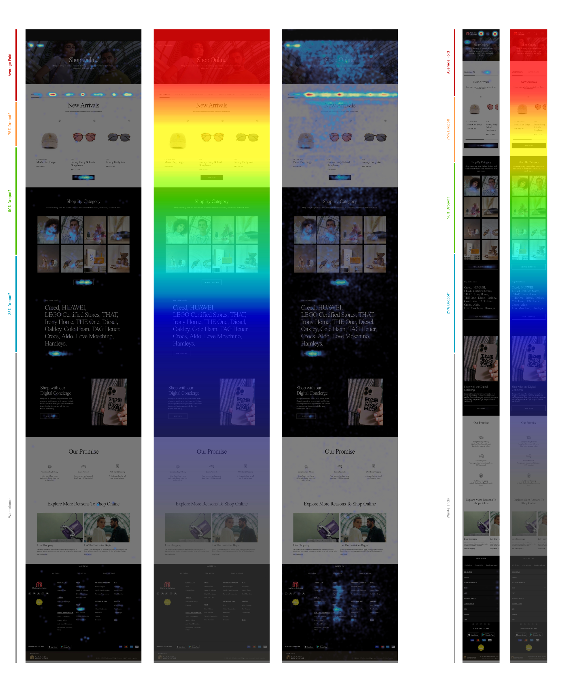
Behaviour analysis
Rather than solving design issues from the start, the Mall Of Emirates website had more pressing matters that took priority over anything else.
The business came to use with the challenge to increase customers engagement and optimise checkout journeys, in order to boost purchases and consequently revenue.
The main point of focus was the online shopping experience. Until this project kicked off, the MoE website was very much a brochure website that had very little e-commerce direction.
As the primary concern of the MoE business team was to understand, why customers were not completing the purchase funnels, our first approach was to analyse the customers behaviour online.
The objective of this project quickly became, how could I tackle MoE’s Category Landing Pages.
Although I saw a very big opportunity for a Mall of Emirates 2.0 in the near future, my main priority and goal at this point was to simplify the way customers get to their desired product.
I identified a number of issues on the old digital experience that I wanted to solve in this MVP release. I firmly believed these changes would upscale the way customers see the MoE brand, and will become a calling card for a new wave of customer acquisition in the upcoming months.
Business alignment
Obviously my main goal is to produce beautiful and rewarding experiences for my clients - and their customers - but when I identify critical points on the existing information architecture and content structure, this needs to be at the top of our list.
Gladly, the MoE business team understood and agreed that our findings showed unclear user paths, broken journeys and plenty of content being displayed in the wrong place.
After a series of workshops, I was able to create a sprint plan that would see us deliver solutions and would also allow the development team to progressively deliver improvements to the site.
Categorisation and content structure
Our first task to map out the old categorisation and discuss why certain terminology was used for each section of content.
The next steps were to map out the optimum scenario that would bring simplicity to the navigation items - much needed, so customers could go straight to a specific product, something the business stressed out initially as a main goal - but also, to align with the other players in the same e-commerce space.
If UX has given us an insight throughout the years, it is that people are very fond of simple habits. Eliminating stress points by building a framework that was logical and familiar seemed like a great starting point.
New navigation
With the content re-organised I could now focus on reshaping the way products were presented to customers.
I implemented a gender split rather than “fashion” as a main category. Kids items would be under the main “kids” category, contrary to the previous version where different kids items were found under kids and home & electronics. Sometimes duplicated.
I included clear levels of information that would be easily replicated by the dev teams when creating filters and navigation between purchase items.
The homepage was still where everything sat, but I proposed the creation of collections for women, men, children, home items and beauty products.
Since personalisation was going to be the next big focus on this project, I wanted to create easy to track interests from different customers to inform our data team what should be the targeting strategy for future releases.
New user interactions
I wanted to create new interactions that prioritised commercial and purchase funnels through customers' journeys.
The rework on all taxonomy done previously allowed us to implement a system where customers could simply toggle between related items without being distracted by multiple, unrelated products.
The goal was to display an horizontal filter section where users would be able to select and deselect items easily and with this keep them focused on specific categories.
Mobile experience and how this was mirrored
In fact, the desktop experience was mirrored from the mobile one, not the opposite.
The management of filters and product selection had some adjustments due to business requirements but, in the end, I was able to complete an experience that was seamless between desktop and mobile and was feasible by the design teams and also the development teams within the agreed timeframes.
The initial thought process of single selection items was not fully implemented due to a reservation from more conservative stakeholders that felt multiselection was a must.
Regardless, the impact we were able to deliver on the Mall Of Emirates website was highly positive and allowed the team to future proof any new expansion on this concept.
How did I go?
It was a hard battle to implement something so different than what the business was used to. Fortunately, data is queen nowadays.
Because of data, behavioural and also quantitative data gathered by the brilliant MoE data analysis team, we were able to support our concepts and implement 90% of changes as initially intended.
With this, the Mall Of Emirates website increased 17%
in user retention, sales went up by 26% in the first quarter after this implementation and churn was reduced by 8%.
-
After a thorough understanding of who MoE’s customers are and what they are lacking, I was able to explore different ways to present products, organise information and rework the information architecture in order to simplify journeys and critical user paths.
-
The thinking I put behind this project was only possible due to the quantity of valuable information I was able to gather at the start and throughout the process. Also, the constant business brainstorms that helped us stay on path and define real user gains.
-
One of the main objectives with this project was to reshape the Mall Of Emirates data pool in a way that future iterations would be easier and extremely logical to implement.


